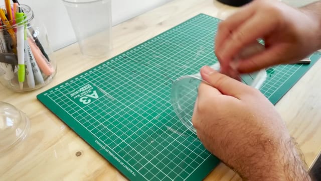
Ink Change with a Prepared Starbucks Cup
The Strokes Come Together to Form a Name
The demonstration starts with a cup bearing writing that does not read as a clear word. With a small movement, the strokes transform into a recognizable name: Julio in this example. The effect uses a prepared inscription and a permanent marker, and can be used as a visual transformation of a word or a name.
In this tutorial, Julio Montoro breaks down the material preparation, the design of the writing, and the performance. The story of the journey that accompanies the demonstration serves as the premise for the effect; the strokes are part of the design prepared for the illusion of the change.
The Cups and Surface Preparation
The setup is explained using two clear Starbucks cups—specifically the Grande size used for frappuccinos—and a compatible lid. Montoro discusses both the dome lid and the flat lid. Although he mentions the possibility of using other cups, the explanation focuses on this specific format; it is a good idea to check the fit if you adapt the materials.
You will also need napkins, a utility knife, a permanent marker, and rubbing alcohol to remove the ink. In the video, he uses Nenuco cologne as an example of the latter. These are everyday objects and consumer products used to craft the gimmick.
The preparation involves two main tasks: removing all printing from one of the cups and erasing the name on the other while carefully preserving the reference lines. Montoro shows how to work on the surface, which parts to keep, and how to fix a line that gets erased during the process. This is a crafting phase that takes time before you move on to drawing.
Designing a Legible Word
The explanation uses the name Julio to teach how to distribute the strokes between the two parts of the setup. You will learn which parts of each letter to draw first and how to complete the word afterward while maintaining proper alignment.
A small heart is also added as an example of a drawing that can follow the same principle. The important thing is to check how the overall design looks when it reaches the final position and how the writing is perceived before getting to that point.
Montoro develops subtle reference marks to recognize that position from the performer's side. You will learn how to prepare the design and check its alignment, rather than having to guess the word by only looking at the side the audience sees.
The Lid, Alignment, and Movement
The lid plays an important role in the appearance and handling of the setup. The tutorial demonstrates how to place it, how to hold the pieces, and how to coordinate the movement with the presentation gesture.
It explains the finger action and the slight shake that accompanies the change, as well as checking the reference marks to know when the word has fully formed. The amount of liquid used during practice is also discussed: the example itself shows why filling the cup too full can make the handling less comfortable.
The inscription is made with a permanent marker. The ability to touch it refers to that writing as presented in the video; the class keeps the setup prepared throughout the routine.
Presentation and Potential Variations
A proper name is the primary application explored here. Montoro mentions other possibilities, such as a word, a celebrity, or a playing card, to adapt the drawing to a different presentation. These are applications of the design: the information that will end up being read must be prepared ahead of time with the setup.
If you want to tie the change to a word supposedly chosen by a spectator, you will need to provide an appropriate selection procedure. The explanation touches on this idea, but focuses primarily on the manufacturing and the physical change, without teaching a word force.
This is a lesson for anyone who wants to prepare a visual effect using a cup and work on the design and coordination of an everyday gimmick. It is advisable to practice the fit, legibility, alignment, and movement from the camera's or spectator's point of view before performing it.